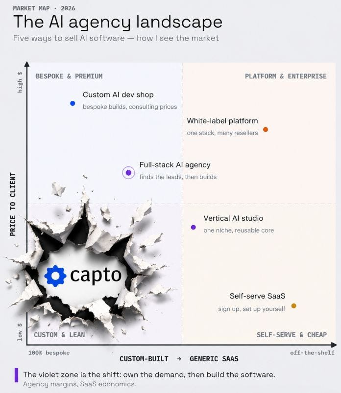
A Quadrant-style chart that actually makes sense!

Book a demo
See what an AI agent could do for your finance team.
30-minute call with a finance automation expert.
Book a demoNo commitment · Clutch-verified reviews
Nothing magical or lacking clarity. 👏🍻Alexandre Rohlfs Aragao
The original version was great. Though allow me to burst Capto onto the scene, share a bit of context where we see ourselves, and why in this case it's good to be in the bottom left.
↘️Bottom-right has to be the biggest red-flag in AI Agents, self-service proprietary SaaS, that ultimately "just doesn't work right"
⬆️The top-left and right quadrants are the more hidden traps, traditional providers trying to change their stripes, with the same results (…and costs)
How we've reimagined our engagements is actually not to be the "low cost" provider by definition, Capto isn't some offshore inexperienced outlet that charges you bottom dollar and you hope for the best. Instead, the cost is low because so is the risk.
🎯Built custom to own
🎯Gauranteed effectiveness, Day 1, and every day after
🎯Pragmatic scoping, delivered and scaled fast
Not to brag but we're basically taking the "good" from every other bullet and exploding out of the bottom left. Does it get any better than that?
Original post: https://lnkd.in/egcB3uXR
—
Originally posted on LinkedIn:
https://www.linkedin.com/posts/petersteube_now-heres-a-quadrant-style-chart-that-makes-activity-7486132854754668544-IOfT
Also published in the Capto newsletter on Substack